+- Curl Global Community (https://communities.curl.com)
+-- Forum: Tutorials (https://communities.curl.com/forumdisplay.php?fid=3)
+--- Forum: Public Training (https://communities.curl.com/forumdisplay.php?fid=4)
+---- Forum: Curl IDE Made Easy (https://communities.curl.com/forumdisplay.php?fid=6)
+----- Forum: Try 4: Displaying Data as a Graph (https://communities.curl.com/forumdisplay.php?fid=12)
+----- Thread: Page 8: Extra Practice (/showthread.php?tid=70)
Page 8: Extra Practice - ashimo - 06-20-2011
Extra Practice
Let’s use options to change the format and colors of a graph.
Practice Problem 1: Basics
Define data like that shown below, and then display a cumulative bar graph for the score1 and score2 data fields. For the x-axis label, use the name field.
Code:
let data:RecordSet = {RecordSet

                         {RecordFields

                             {RecordField name, domain = String},

                             {RecordField score1, domain = int},

                             {RecordField score2, domain = int}

                         },

                         {RecordData name = Matt, score1 = 30, score2 = 45},

                         {RecordData name = Sarah, score1 = 55, score2 = 40},

                         {RecordData name = Jacob, score1 = 20, score2 = 65}

                     }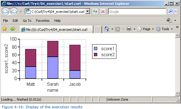
Hint: To display the cumulative graph, use stacking-mode = ChartStackingMode.stacked with BarLayer.
Solution
Solution Program: c:\Curl\Try4\04_exercise1\start.curl
Code:
{import * from CURL.GUI.CHARTS}

{value

    let data:RecordSet =

        {RecordSet

            {RecordFields

                {RecordField name, domain = String},

                {RecordField score1, domain = int},

                {RecordField score2, domain = int}

            },

            {RecordData name = Matt, score1 = 30, score2 = 45},

            {RecordData name = Sarah, score1 = 55, score2 = 40},

            {RecordData name = Jacob, score1 = 20, score2 = 65}

        }


    let chart:LayeredChart = {LayeredChart

                                 height = 5cm,

                                 width = 10cm,

                                 {BarLayer

                                     stacking-mode = ChartStackingMode.stacked,

                                     x-axis-data = {ChartDataSeries data, name},

                                     {ChartDataSeries data, score1},

                                     {ChartDataSeries data, score2}

                                 }

                             }

    chart

}
Practice Problem 2: Basics
Display the data used with Practice Problem 1 as a bar graph. In this problem, reverse the directions of the x- and y-axes and then display the graph.
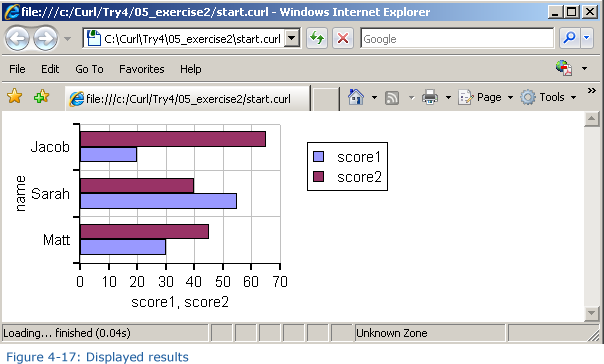
Hint: To change the orientation of the graph, use flipped? = true with LayeredChart.
Solution
Solution Program: c:\Curl\Try4\05_exercise2\start.curl
Code:
{import * from CURL.GUI.CHARTS}

{value

    let data:RecordSet =

        {RecordSet

            {RecordFields

                {RecordField name, domain = String},

                {RecordField score1, domain = int},

                {RecordField score2, domain = int}

            },

            {RecordData name = Matt, score1 = 30, score2 = 45},

            {RecordData name = Sarah, score1 = 55, score2 = 40},

            {RecordData name = Jacob, score1 = 20, score2 = 65}`

        }


    let chart:LayeredChart = {LayeredChart

                                 height = 5cm,

                                 width = 10cm,

                                 flipped? = true,

                                 {BarLayer

                                     x-axis-data = {ChartDataSeries data, name},

                                     {ChartDataSeries data, score1},

                                     {ChartDataSeries data, score2}

                                 }

                             }

    chart

}
Practice Problem 3: Basics
Using the same data as that used in Practice Problem 1, display the score1 data as a bar graph, and the score2 data as a line graph, as shown in the figure below:
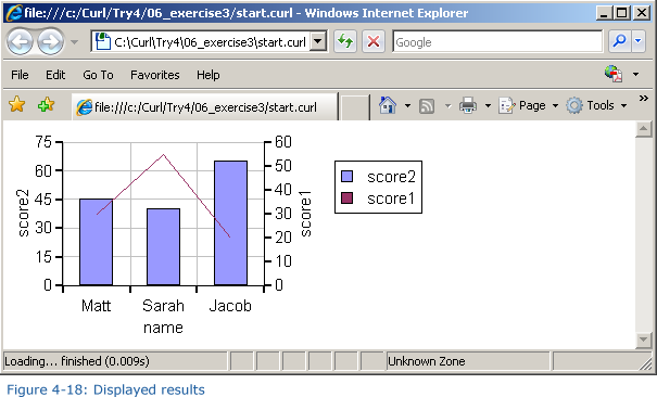
Hint: LayeredChart can have multiple ChartLayers.
Solution
Solution Program: c:\Curl\Try4\06_exercise3\start.curl
Code:
{import * from CURL.GUI.CHARTS}

{value

    let data:RecordSet =

        {RecordSet

            {RecordFields

                {RecordField name, domain = String},

                {RecordField score1, domain = int},

                {RecordField score2, domain = int}

            },

            {RecordData name = Matt, score1 = 30, score2 = 45},

            {RecordData name = Sarah, score1 = 55, score2 = 40},

            {RecordData name = Jacob, score1 = 20, score2 = 65}

        }


    let chart:LayeredChart = {LayeredChart

                                 height = 5cm,

                                 width = 10cm,

                                 {BarLayer

                                     x-axis-data = {ChartDataSeries data, name},

                                     {ChartDataSeries data, score2}

                                 },

                                 {LineLayer

                                     {ChartDataSeries data, score1}

                                 }

                             }


    chart

}